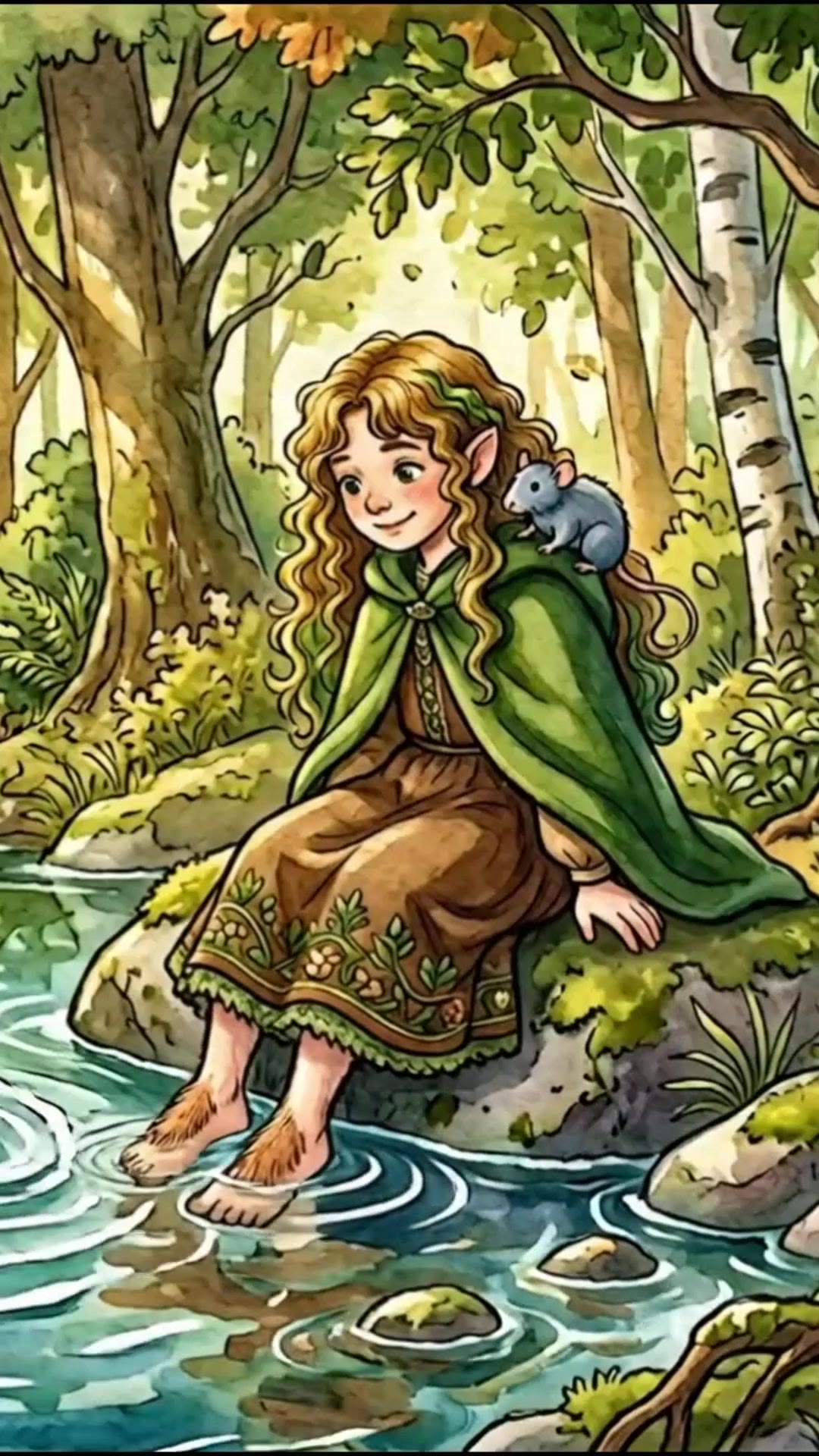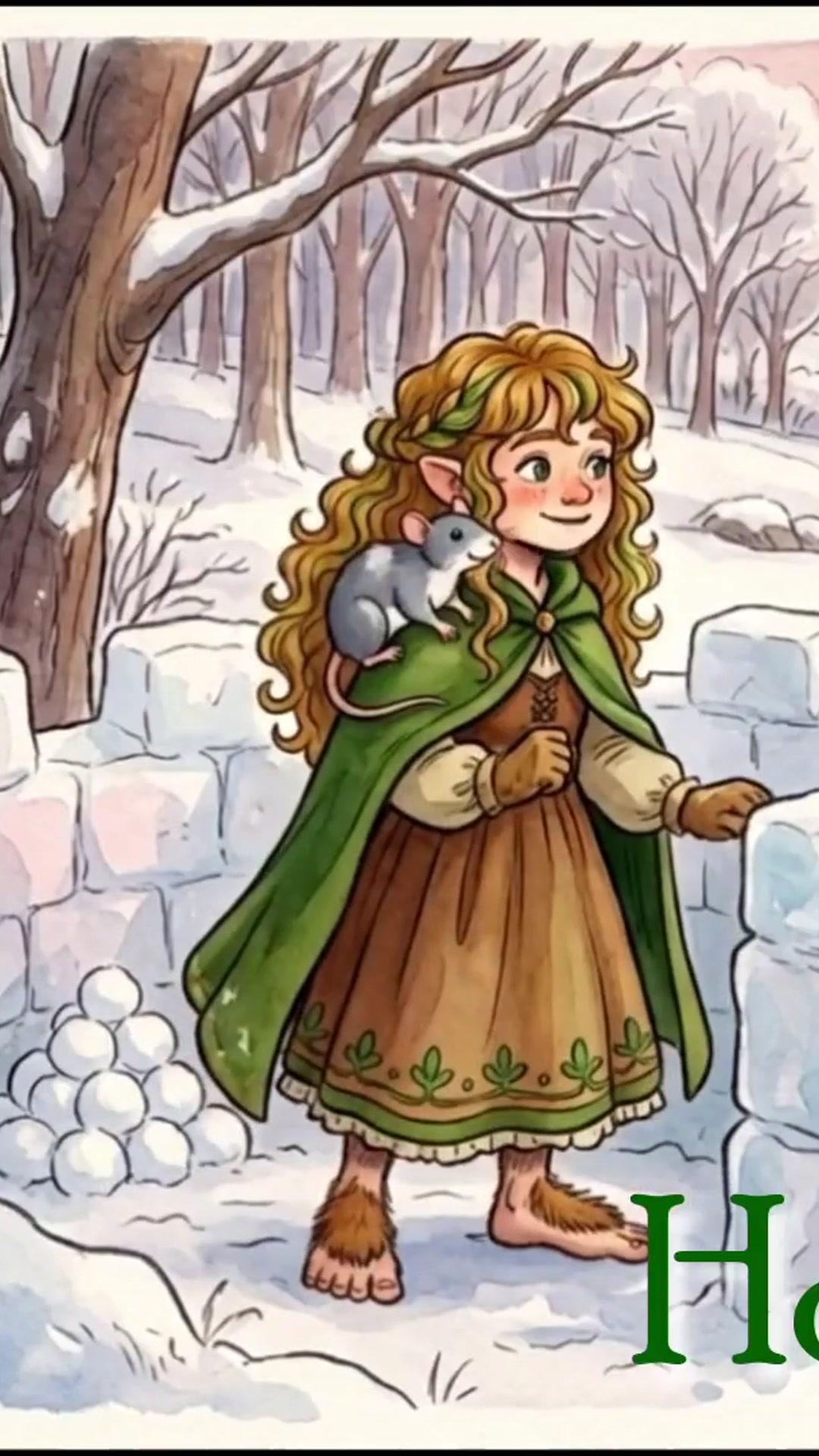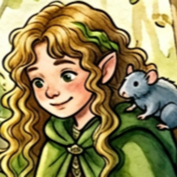
Illustrated portrait of the Lily Fernwild persona with her pet rat

Design Portfolio · Fernwild Studio

Lily Fernwild

AI visual design, illustration direction, and creative direction for games, made with a writer's eye for clarity.

I take ideas from a blank page to finished, published work: illustrated music videos, an animated short, YouTube key art, and the creative direction of a mobile game. I work in generative AI tools every day, and the job is mostly judgment. I keep a look consistent across a whole series, notice when something doesn't land, and give clear notes until it does.
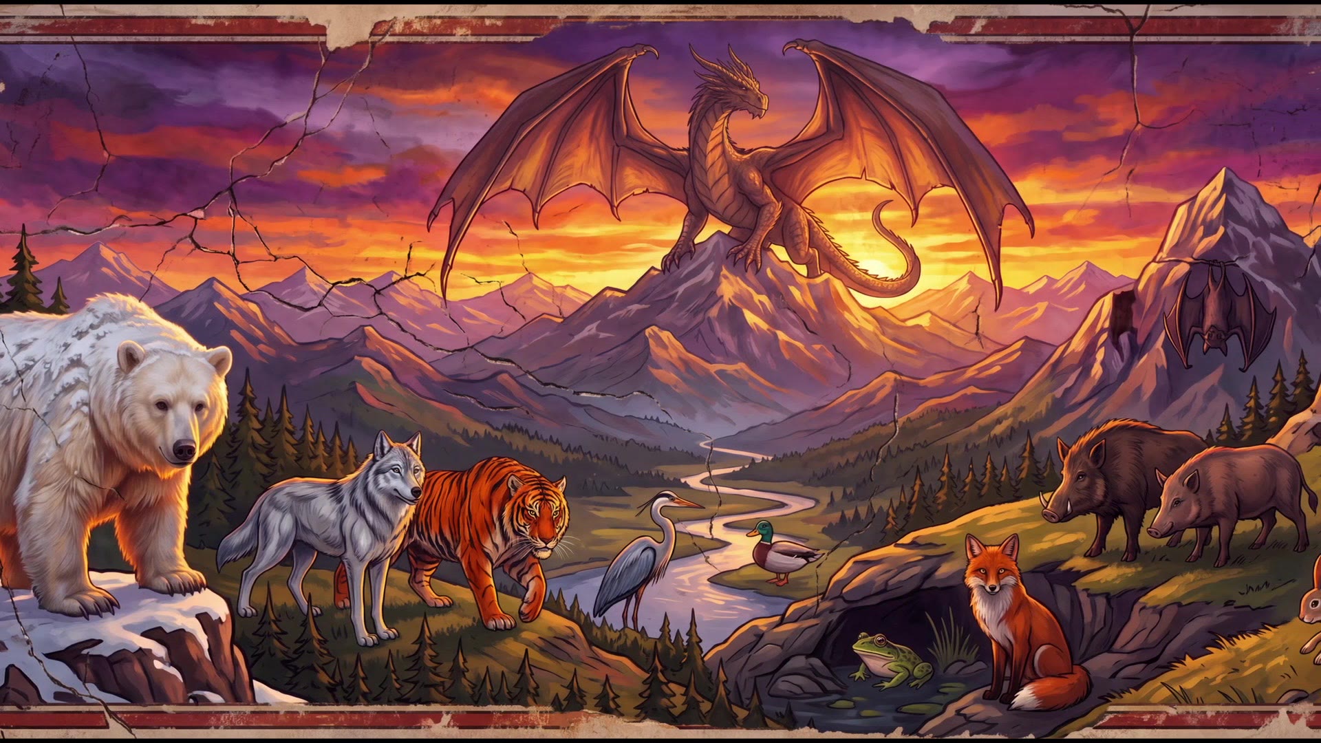
Pantheon of Aspects: a dragon over a sunset valley with bear, wolf, tiger, heron, fox, and boars
The pantheon fresco from Pantheon of Aspects, the animal gods of TRAG: Shattered Seas
  1. Pantheon of AspectsMythic fresco short · art direction
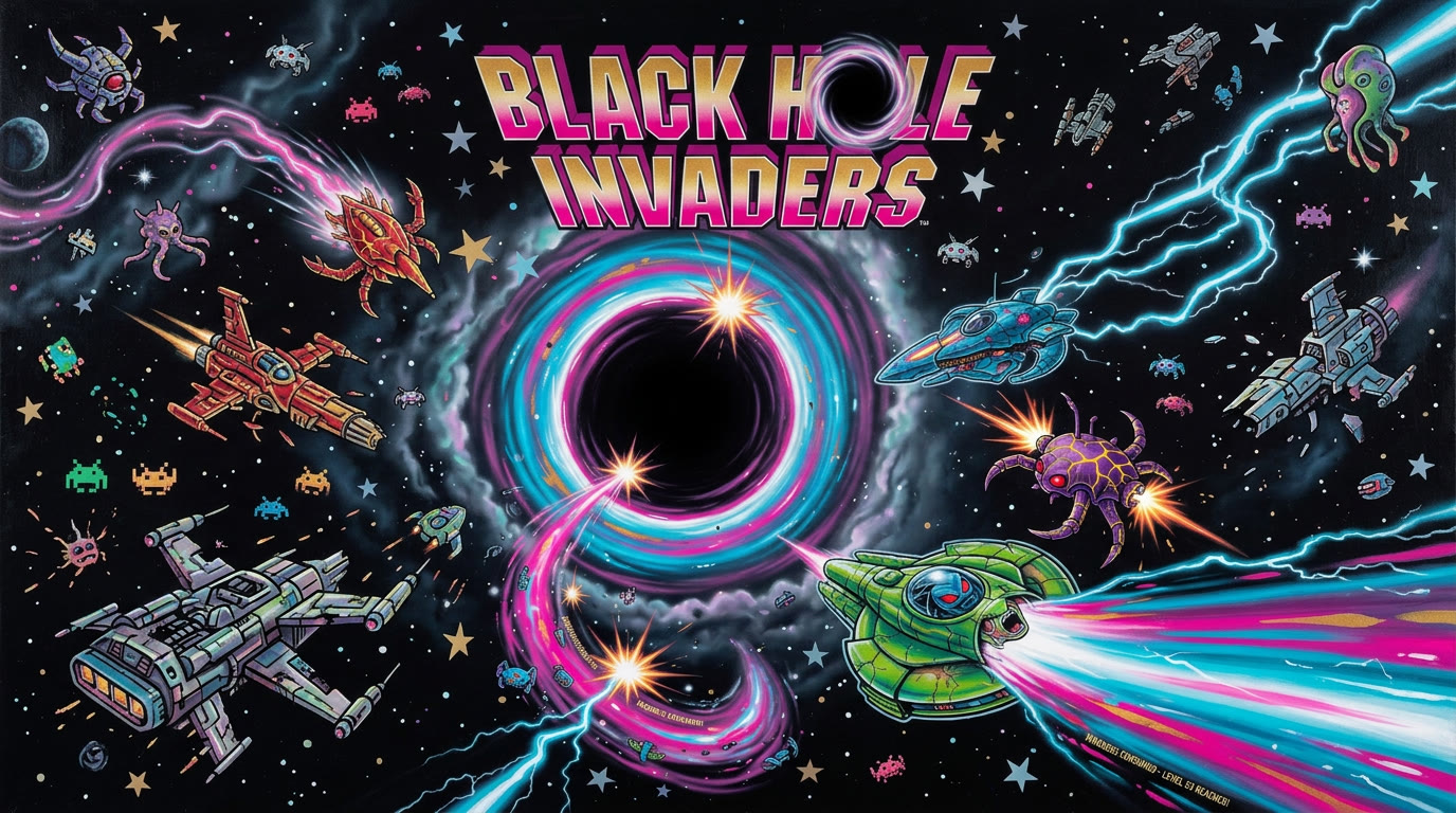
  2. Black Hole InvadersGame direction · cutscene
  3. Directing game feelAudio & state changes
  4. Design notes from the BuildLayout · menus · HUD
  5. The 23rd Psalm & hymnsCharacter consistency
  6. Music video key artStyle range · typography

Art direction · Style guide · Mythic short film

Pantheon of Aspects

A 2–3 minute mythic short about the Aspects, the animal gods of TRAG: Shattered Seas, the LARP world my friends and I run. It's based on fables I wrote for that world.

The picture in my head: titans striding over mountains, with forests brushing their bellies. The film opens on a pan across a pantheon fresco, then gives each Aspect its own moment. Every Aspect card pairs a still with a five-second animated shot, and the Aspect's name and domains sit in two lines of elegant medieval-renaissance title text. I chose a camera angle for each animal.

Role
Concept, source fables, style guide, prompt direction, bear voice, edit
Tools
Nano Banana 2 (keyframes), Grok Imagine (animation and voices), Seedance (card shots), Suno (score), DaVinci Resolve (edit), Cinzel Decorative (end titles)
Watch
youtu.be/hCXrZEPf12w

My direction notes

The style

Stylized mythic fresco: saturated colors, a sunset with deep shadows and sharp highlights, and outlines slightly broken and time-worn but still legible.

Later I pushed it further toward medieval and renaissance outlining and brush strokes, cracked plaster, and an epic titan scale.

Holding the world still

No warping mountains. No warping large trees.

When the animation started bending the landscape, I rejected those shots and wrote “lock”-style prompt language to keep the terrain fixed.

Cards that stay on-model

“Lock style of start frame. No music, no soundtrack, no voices, only sound effects.”

Every card's video prompt opened this way, so each five-second shot matched its still and left the score to Suno.

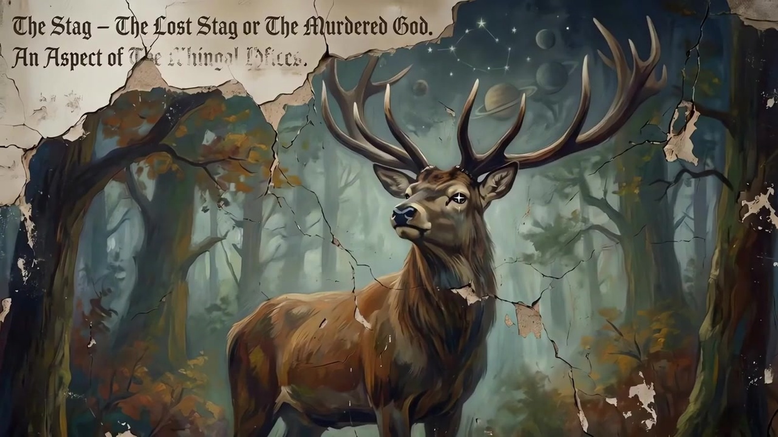
Fixing the Stag

More weathering, less misty and dim. A crown of stars with faint planet outlines, and an eye that sparkles like a star.

The first Stag came out too misty and dim, so I gave revision notes to bring it in line with the fresco look.

Voices

Grok voiced the Wolf and the Tiger. When the male voice didn't work for the Bear, I recorded the Bear myself.

The film mixes AI voices with my own performance.

Finishing

A Suno score, the full cut in DaVinci Resolve, and end titles set in Cinzel Decorative.

I cut the film and set the end titles myself.

Game creative direction · Art direction · AI-assisted development

Black Hole Invaders

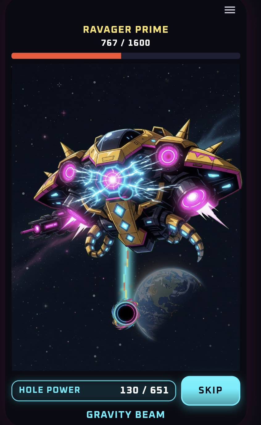
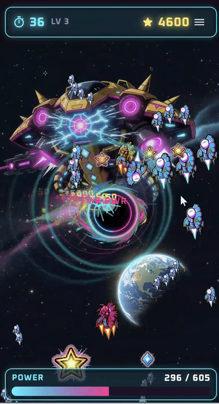
A mobile arcade game I directed using Grok Build, an AI-assisted development tool. You steer a black hole, eat alien ships, fill the power bar, and fire a gravity beam at the mothership.

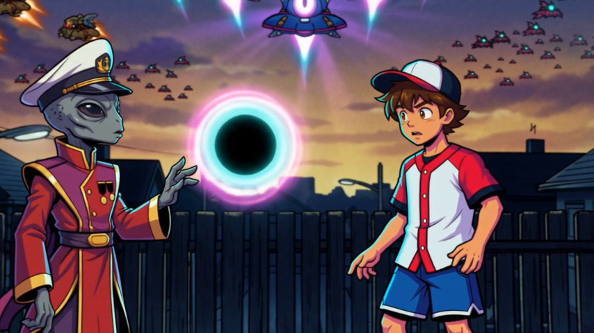
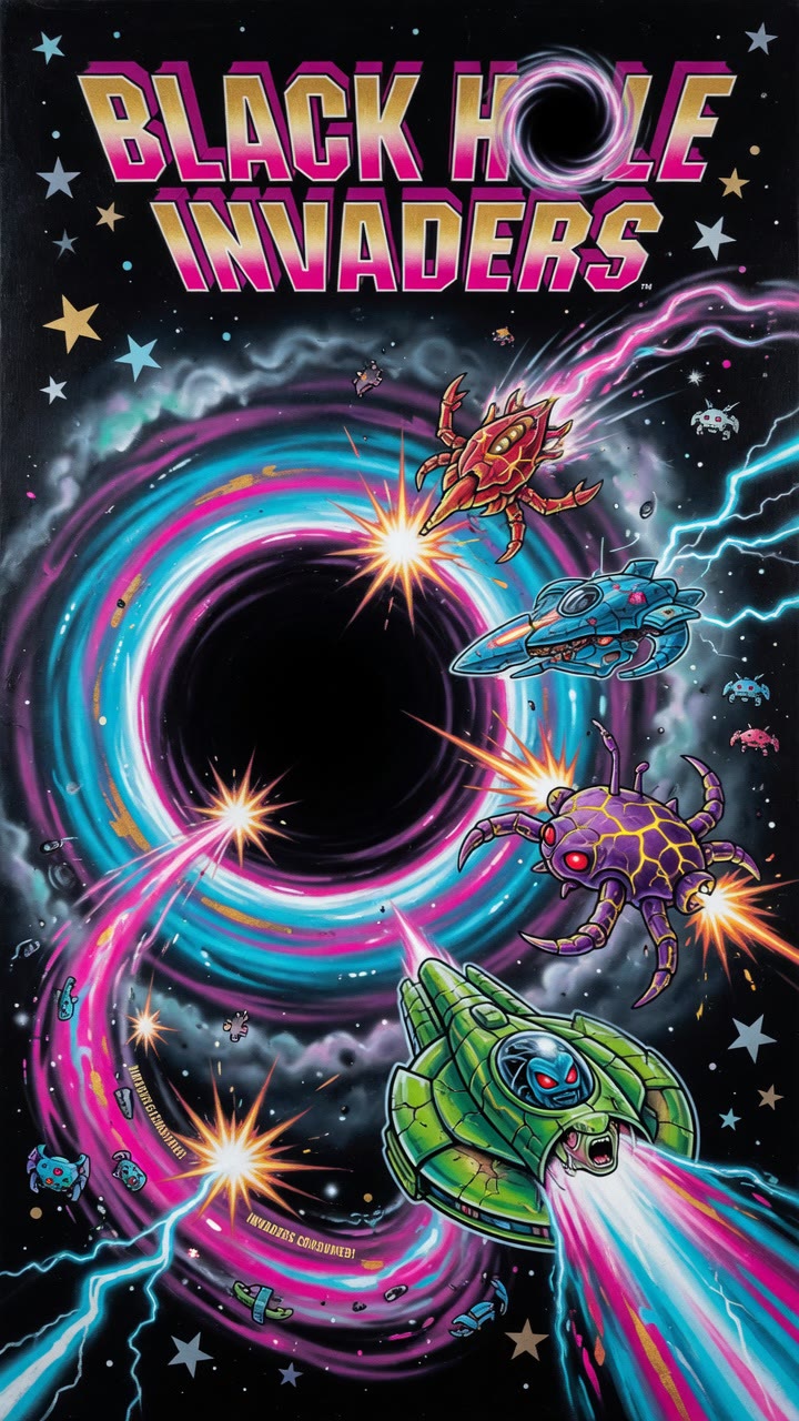
I set the concept, the look, and the feel, and steered development through Grok Build with direction and revision notes. That covered the retro chrome logo and key art, the enemy and boss designs, the neon menu and HUD style, the sound and music, the screen-by-screen layout and menu rules (see the design notes below), and the animated opening cutscene, which I also edited.

The neon palette carries meaning: cyan for navigation, gold for currency and events, and hot pink for the action you should take next.

Role
Creative direction, art direction, game-feel and audio direction
Made with
Grok Build (AI-assisted development), AI image and video generation, OpenArt, DaVinci Resolve, sfxr.me, BeepBox
Play
Playtest demo on itch.io
Watch
Opening cutscene

From my direction, in my own words

The concept

“A space themed one where you control a black hole eating powerups and alien ships and once the time is up it shoots at a mothership.”

The core loop I pitched: eat, fill the power bar, then fire at the mothership. Mobile first, Steam later.

The look

“A retro-feeling space game, like an arcade game from the 80s, but with some anime flair.”

That brief became the art bible. For the cutscenes I pushed further: “change the global style to be more anime-like.” For the home screen I asked for art like the side of an arcade cabinet.

The name

“It might be nice to have black hole in the name so people browsing the play store know it's a hole-in game.”

Then I asked for “a quick way to get in the space invaders idea.” That led to Black Hole Invaders.

The characters

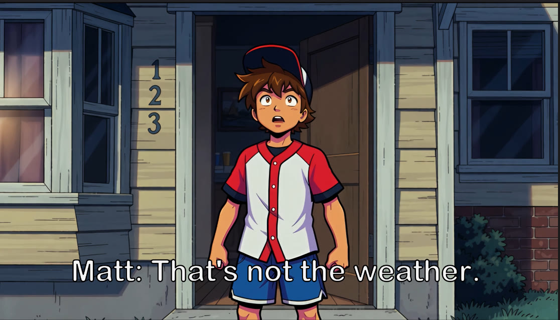
Matt: “plucky young boy thrust into danger who rises to the occasion.” Zhaun: “gray skin but not a stereotypical gray alien … calm presence, wise expression, a little sad and worn.”

I wrote both character briefs, down to the jersey, the cap, and the naval-commander hat.

The story

“A protagonist waking up to see alien ships in the sky, then an alien of a friendly race shows up in his yard and gives him the power to use a black hole.”

The power-ups on the field come from the mentor, whose power is limited. That gives the story a reason for the game mechanics.

The rhythm

“Every level that ends in 3, 5, and 7 should be a hard level, and every level that ends in 0 is super hard.”

Six in ten levels stay very doable for casual players, and the map uses color to flag the hard and super-hard levels.

Directing & editing

The opening cutscene

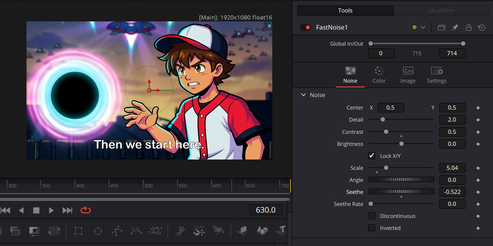
The game opens on the story beat I outlined: Matt wakes to alien ships filling the sky, and Zhaun arrives in his yard to hand him a black hole. The script was drafted with Grok. I set the anime look, built the environment and character reference art, animated the shots with AI video tools, and cut it together in DaVinci Resolve with subtitles and effects, so the cutscene leads straight into level 1.

The title art, characters, and glowing black-hole motif match the game, so the cutscene and the game feel like one world. Watch the opening cutscene on YouTube.

Case study · Black Hole Invaders

Directing game feel: when “close enough” isn't

The game's sound effects and music came from my direction in a single working session (September 1, 2026). The notes below are what I actually asked for, in my own words.

What mattered most was playing the music inside the game, not just listening to it on its own. That's how the biggest problem came to light.

  1. Sound effects

    “Make swallow a little deeper.”

    The sound effects are an 8-bit set made with sfxr.me. After hearing a draft, I asked for a heavier gulp when the black hole eats a ship. The deeper version is the one in the game.

  2. Music plan

    Menu loop, eating loop, siege loop

    I specified three BeepBox loops, one for each game state: the title menu, the eating phase, and the mothership siege.

  3. Revision 1: intent

    “Remix all 3 in A major, give eating a more upbeat and urgent feeling, the black hole is having fun eating the ships.”

    One shared key so the loops hang together, and a note about the character's mood, not technical settings.

  4. Revision 2: tested in the app

    “Make a new version of siege loop with different percussion than eating loop. They sound too similar when played back to back in the app, I want a clear differentiation when siege begins.”

    Playing the game, I noticed the change from eating to siege didn't register. The fix was a new siege loop with different, half-time percussion, so the boss phase now feels like a real shift.

Swallow (final)8-bit sound effect, deeper version
Menu loopTitle screen, A major
Eating loopUpbeat and urgent
Siege loopBoss phase, new percussion
Test in contextThe real problem only showed up during play, when two loops ran back to back.
Design for state changesA new phase of the game should feel different the moment it starts.
Give intent, not settings“The black hole is having fun eating the ships” is a note anyone can act on.

Case study · Black Hole Invaders

Design direction notes from the Build

While directing the game in Grok Build, I gave notes screen by screen. These are my notes, condensed: the rules I set for layout, menus, onboarding, the HUD, the store and map, and the reward screens.

Most of them come down to a few principles. Respect the phone screen. Never make the player hunt for a way out. Show only what's useful. Every state should look like what it is.

Phone layout

Fit the screen, don't shrink it

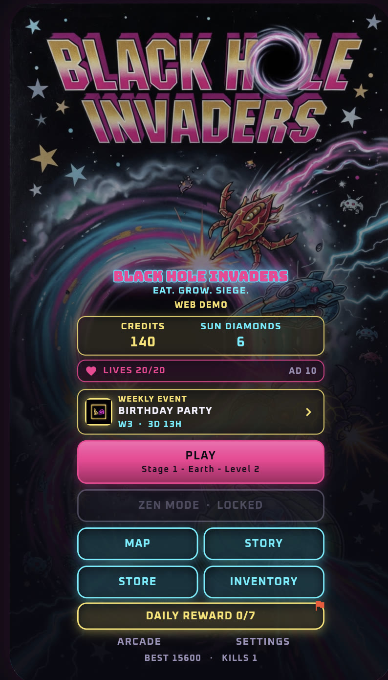
  • Home and the launch bay each fit on one phone screen, with no scrolling. The map follows the same rule: fill the screen, but don't shrink things so far it looks empty.
  • The Play button carries its own label (stage, stage name, level number) instead of a caption beside or under it.
  • Home uses hand-painted arcade-cabinet side art, not vectors or silhouettes. The same arcade background carries through to the store, inventory, map, weekly event, and Zen mode.

Menus

One way out, everywhere

  • One menu control you can reach everywhere, including the launch bay, so a player can back out before a run. It's present but unobtrusive during play.
  • Each place gets only the options it needs. In a run: pause, restart, sound, music, home. Launch bay: sound, music, home. Home settings: sound, music, About.
  • Later additions (volume sliders, a haptics switch, a Tutorial replay button) go at the top of the sheet, because controls under the sliders were getting clipped. I also asked for map access from the launch bay.

Tutorial cards

Readable at a glance

  • After the opening cutscene and before level 1, popup cards appear. The first shows the black hole with “Drag the black hole to eat alien ships and power-ups,” then one card for each ship and power-up.
  • Easy to tap through, with large art and text big enough to read. The body copy is never clipped, and the card never scrolls. Each card sits centered between the step counter and Next.
  • Ships on the cards and in the field key lie sideways, so the whole sprite shows, nose to exhaust.

HUD

Every number should be doing something

  • Ships and pickups never draw on top of the timer overlay.
  • In the siege, the mothership's health bar shrinks at the real destruction rate, not all at once. The black hole's stored power moves to the bottom and counts down in place of the bar you just filled, so a full bar doesn't just sit there.
  • In Zen mode, the bar fills once and then glows as the number climbs, instead of emptying and refilling.
  • The field key before a run shows only what's in that level, and what each item gives the hole.

Store, inventory, map, weekly

Show only what's useful to the player

  • The store can scroll a little, but it should be dense, with several items per row. The life refill is larger but shorter, with no ticker beside it.
  • No ticker when it has nothing to say. When there is one, it's tappable. Inventory thumbnails should all look different from each other.
  • The map doesn't print the color key twice or show internal lines like “locked reels stay dark.” Locked cutscenes stay visibly locked.
  • The weekly event says what you win (beat a level for a free cosmetic from this month's theme), plus the week number, time left, and theme name. Color labels read “CYAN: Standard,” with a colon.

Results

Make replay value obvious

  • Clearing a level earns 1 to 3 stars. The map shows the stars earned and each area's total, so it's obvious when replaying for a better rating is worth it.
  • Victory screens can go big on anime title-card energy: huge type, sparkles, dramatic poses. The playfield stays cleaner than those screens, so play stays readable.
Home screen from the September demo with PLAY Stage 1 Earth Level 2
Home screen (Sept 2026 demo): one screen, and the Play button carries the stage, area, and level
Siege phase with hole power counting down at the bottom
Siege: the mothership bar at the top, stored hole power at the bottom

What these notes show

Hierarchy: one primary action that carries its own context.

Clarity of state: locked looks locked, a full bar does something, and a siege looks different from eating.

Readability: no clipped copy, no scrolling cards, no sprites cut off.

Restraint: no internal labels, no empty tickers, no doubled keys. Save the spectacle for the victory screens.

Character consistency · Animated short · Thumbnails

The 23rd Psalm & the hymn series

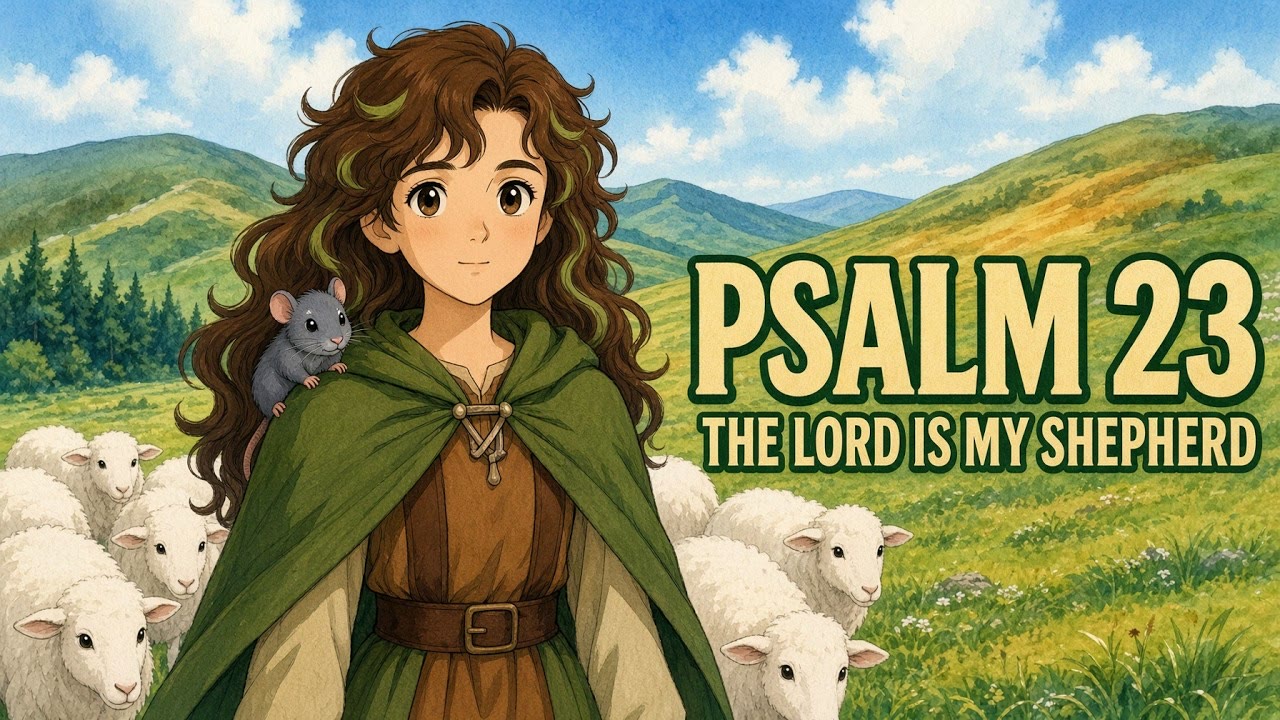
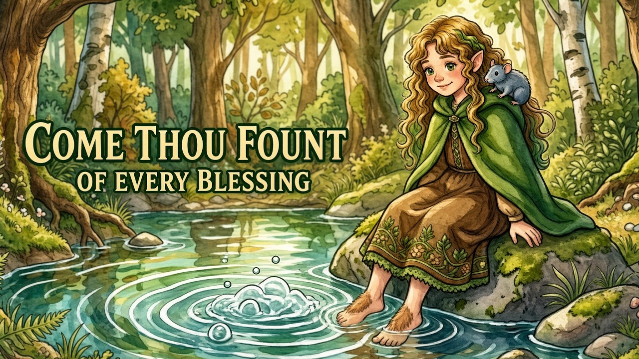
One storybook heroine, my Lily Fernwild persona with her pet rat, carried across an animated short and a whole channel of illustrated hymn videos.

The 23rd Psalm is a three-minute animated short. Her face, curls, green cloak, and rat stay recognizable from scene to scene. That's the hardest thing to hold in AI animation.

The hymn series keeps one soft watercolor style across more than a dozen songs, so the channel reads as one body of work. The thumbnails are built for phone size: one clear focal group, a heavy two-line title, and a single accent color. Each hymn also has a 9:16 cut for TikTok and YouTube Shorts.

Role
Character design, art direction, animation, edit, thumbnails
Tools
AI image and video generation, Suno, Audacity, DaVinci Resolve
Watch
The 23rd Psalm · the full channel

Style range · Key art · Typography

Music video key art

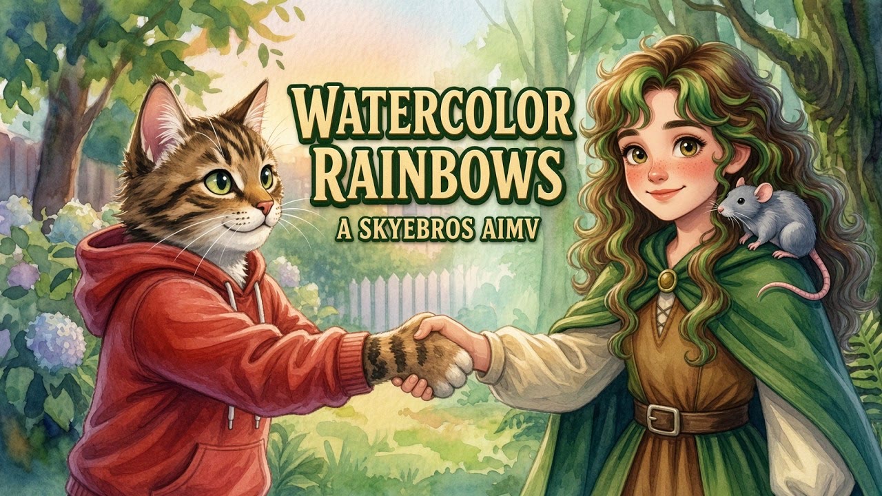
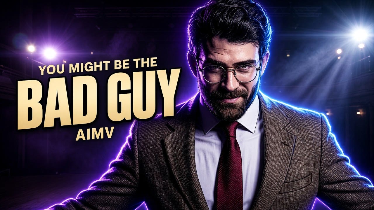
Three very different visual languages, each one picked to fit the song.

Watercolor Rainbows (Skyebros): soft storybook watercolor, a hand-lettered title, warm greens. It's the style I offer as custom watercolor lyric videos on Fiverr.

You Might Be the Bad Guy (dark trap): cinematic stage lighting, one figure against near-black, and heavy condensed gold type.

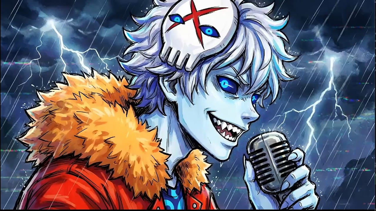
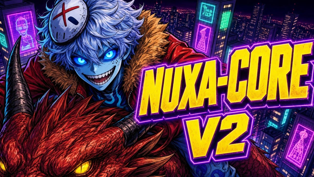
Nuxa-core (Nuxanor): an online personality I admire, drawn in high-energy neon anime, with a remastered V2 cover. It's my most-viewed video so far.

Role
Concept, art direction, edit, thumbnails
Tools
AI image and video generation, Suno, DaVinci Resolve
Watch
Watercolor Rainbows · Bad Guy · Nuxa-core

About

A writer who directs pictures

Before AI art, I spent 20 years writing and proofreading professionally: copywriting at a marketing and design agency, editing and laying out a student newspaper, and writing process documents and templates for a remote support team. That background shapes how I direct. I describe the intent clearly, check the result where it will actually be used, and give specific notes until it's right.

I also do paid AI training work with DataAnnotation.

Toolkit

Image & video
Grok Imagine, Nano Banana 2, Seedance, Kling, OpenArt
Music & audio
Suno, Audacity, BeepBox, sfxr
Edit & layout
DaVinci Resolve
Game direction
Grok Build (AI-assisted development)
Writing
Copywriting, proofreading, editing, process documentation